The features of a great ‘book a demo’ page
Digital Marketing
Customer Experience
Website Development

As marketers, we all know the life and death situation that is landing page design. The fact is that every minute detail can make the difference between gaining a lead or increasing your website's bounce rate.
So when it comes to trying to make people book a demo, it can become increasingly more difficult.
Why is it more difficult? Well, you are essentially asking someone to give up a portion of their time to sit down and begin a sales process.
Luckily, the vast majority of the time, the reason why someone wants to demo a software, is because they are actively looking for it.
So, what are the differences between a great landing page and a great book a demo page? And how do you optimise a book a demo page for conversions?
It’s a decision process that you need to influence
A standard, high performing, lead generating landing page is all about being streamlined and to the point. People want to get the content as quickly as possible with as few steps as possible. So that means a small form with a couple of data fields and the lead generation piece summed up in a few concise bullet points. It’s designed to funnel people directly to the CTA without any distractions.
A book a demo page, on the other hand, is a completely different beast. Users who visit a demo page are in a slightly different mindset. They are in what is known as the decision stage of the buying journey. To put it in simple terms, they have a problem that needs to be solved and they are actively looking for a solution.
A great book a demo page will provide just enough information not to bog down the user. It will use a form with enough fields to gather the vital information about the user, without making it a chore to fill in. It needs to be able to influence the user's decision and show them that you are the solution to their problem without scaring them off with detail.
A great 'Book a Demo' page builds instant trust
So what are the features of a great book a demo page?
Logo and branding
When people click onto the demo page from any channel, the first thing they will look for is the name and brand of the company. People buy products based on brand strength and if your branding is strong on the page, it will only help your cause.
Remember that it shouldn’t dominate the page. You want people to concentrate on the calls to action.
Headline and sub header
This is what the user will immediately read and it’s important you get it right. Keep it straightforward and be concise in exactly what you are offering. Include demo in the title and subtitle if you can - this will reinforce exactly what you are offering.
It’s important not to go overboard with your title - if there is too much info, it will cause people to leave the page.
The Imagery
Best practice for any type of landing page is to make sure the imagery isn’t too distracting. With a book a demo page it’s a good idea to maybe show off one or two shots of your product in action. A popular option is to add a screenshot into a computer monitor image just so it isn’t as obvious.
Again, don’t go overboard with images as it will just become too distracting to the user.
CTAs
The call to action is where the decision you’re after is won or lost. It’s where you will collect the user's details and it’s often the place where most potentials will be lost.
A book a demo form is all about getting the right balance of data fields and information. It would be great if you could ask for every bit of information about someone's company background and personal life, but the fact is… it will cut conversions.
Ask for the minimum you need to build up a good picture of the user. Normally, Email, Phone Number, Name & Company will be enough for you to get in touch with a prospect and deliver the best sales solution. Having said that, asking for a phone number is a big turn off for people at form completion time. If your sales team can do without it then consider omitting it from your form.
Remember to make the CTA stand out on your page. It should contrast to the colour scheme of the page and should be big enough to make an impact. The CTA button copy is just as important and should be persuasive.
Social Proof
Book a demo pages are all about trust…
People need proof that the software they want to buy is quality and has a good customer base. The best demo pages will either include testimonials or customer logos, ideally both.
Like most of the features, don’t go overboard on the number of logos or testimonials.
Give the user a glance at your product
Demo pages are a great way to show off your product to your audience and to make people act. You should give enough information for a user to make an informed decision about your product without overloading them.
Actually selling your product is the challenging part, but hopefully with a quality optimised demo page you can help potential customers along their purchasing decision path.
Examples of great 'Book a Demo' Pages
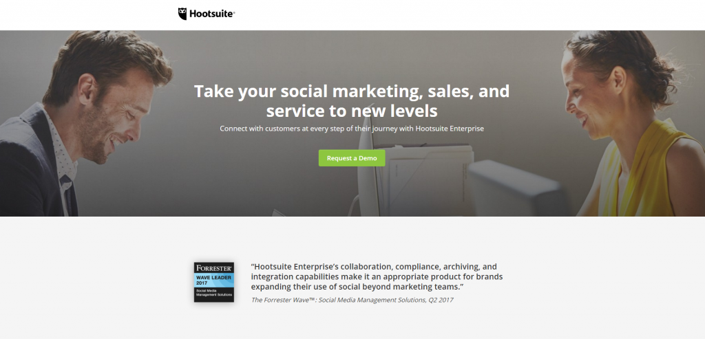
Hootsuite

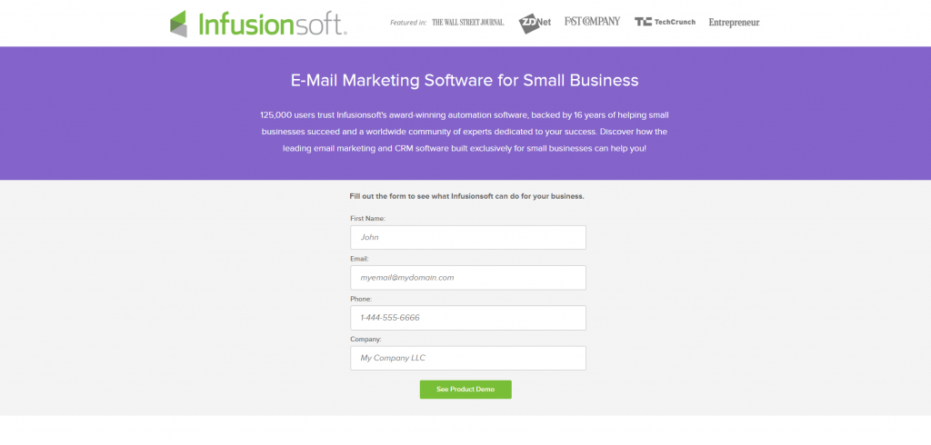
Infusionsoft

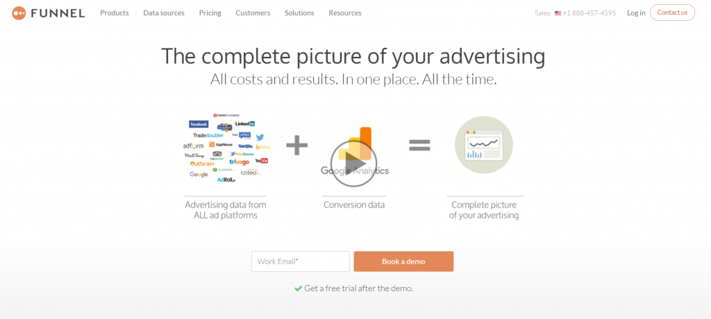
Funnel


